By Sarah Rothwell
Sat high above the banks of Windermere in the English Lake District, is Blackwell Arts and Crafts House, the former holiday home of the Manchester industrialist Sir Edward Holt (1849–1928). Designed by British architect and artist Mackay Hugh Baillie Scott (1865–1945) at the turn of the last century, the house was conceived during a period of renewed interest in artisan crafts and the handmade that countered growing mechanisation and mass production. Subsequent changes saw the family giving up the house, it being used as a school for evacuee’s during the second world war, and finally as offices. Blackwell, and its richly decorated interior showcasing the best craftsmanship of the Arts and Crafts Movement both locally and from across the UK, was only saved from being a distant memory thanks to the Lakeland Arts Trust, who restored the house to allow it to be opened to the public as a period house and gallery in the early 2000s. Upon encountering Blackwell, you cannot help but be captivated by its beauty. The often watery Cumbrian light traverses through the space illuminating the interior so that your eye travels from the wonderfully carved ornamental wooden panelling to the stained glass windows, and from printed wallcoverings to ornamental plasterwork that reflect and play homage to the surrounding natural environment. The House’s orientation allows every window to frame and capture the distant fells beyond. It is a truly special location in which to celebrate creative endeavours, both historical and contemporary. It therefore seems fitting, that this architectural gem of the British Arts and Crafts Movement has become the setting for the first UK retrospective of Edinburgh-based ceramic artist Frances Priest. For over twenty five years, Priest has been exploring decorative motifs, form, and movement, creating sculptural ceramic artworks that have become widely recognised and celebrated for their reverence to ornament.
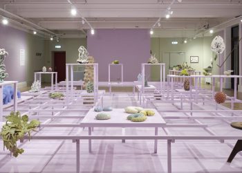
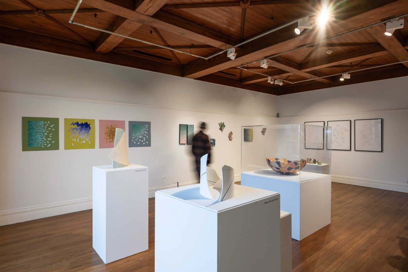
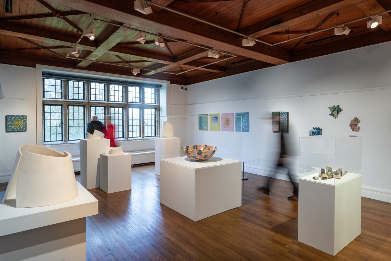
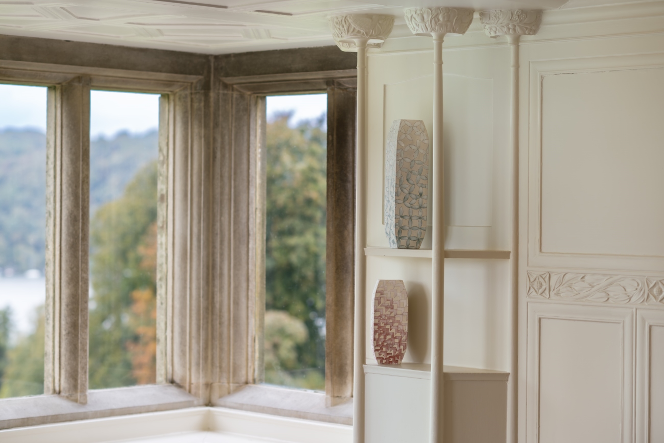
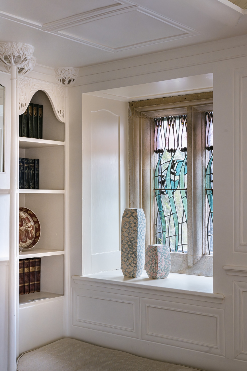
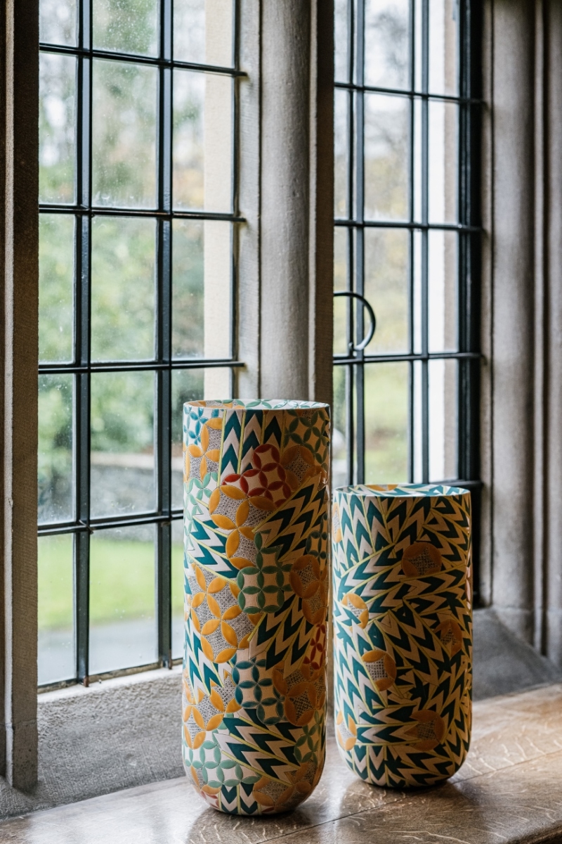
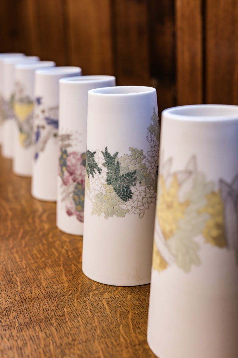
Frances Priest: Motif | Line | Colour brings together over 60 works of ceramics, drawings and artworks from across her making career, into the intimate and historic setting of Blackwell, allowing for a range of exchanges between the viewer and Priest’s work that is beyond a typical gallery exhibition experience. We do not encounter her work in isolation set within a minimalist white cube, but through encounters integrated into the rich interior spaces of this Arts and Crafts home. It is as if her artworks are part of the fabric of the building, or artifacts of past custodians, allowing for direct correlations between her practice and the legacy of ornamentation she celebrates. Through their placement in this Arts and Crafts tableau, we see the artist’s eye directing these encounters. Some could be easily overlooked but bring such joy upon their discovery, such as her work Shift Intersect I placed in the window well of the house’s porch. Its form echoes the movement of the stained glass flowers and birds in the panel behind, and its subtle colour nods to the slate floor you stand upon. Others directly draw our attention to decorative motifs present in both the interior and artwork, as seen in the positioning of Gathering Bowl – Collage medium situated below the printed hessian wall covering with their echoing daisy motifs in the dining room. In turn, the Cumbrian landscape beyond the windows beneath which seven of her Patterns of Flora vases sit, illuminate and create sympathetic shadowing to the botany she has stunningly illustrated upon their surfaces. Whereas her new series of works created for the White Drawing Room and named in honour of this space, nestled within the decorative integrated shelving by Baillie Scott, feel as if they are part of the original decorative gesso scheme in their delicate tracery of shared motifs of leaves and chevrons and powdery surface treatment. Elsewhere, the gallery display does not follow a specific timeline or key events but creates moments of discussion between the past and present, gallery series and public commissions.
In the case of Priest’s most widely known works, I have often described experiencing these as an encounter with an architectural sculptural memento, due to the opulently drawn and incised ornamentation that encompasses the entirety of the form, almost as if she has scooped up a mosaic or tiled surface and presented it for our delectation. Priest found inspiration in decorative pattern and ornamentation from an early age. As a child, her parents gifted her an abridged reproduction of The Grammar of Ornament by British architect, designer and design theorist Owen Jones (1809–1874) who is considered one of the most influential tastemakers of the Victorian era, due to his pioneering studies on colour theory, geometry and form. This publication came to have a profound and lifelong effect upon Priest, seeing her interpret aspects of its 100 vibrant chromolithographic plates that illustrate Jones design principles which underpinned the natural world and the architecture, textiles, manuscripts and decorative arts of nineteen diverse cultural periods throughout her artistic practice. Her journey through ornamentation has changed over time, from delicate mark making and standalone motifs, to vibrant colourful explosions of decoration. However, at the heart of her practice is her desire to capture through the process of drawing, similarly to the Grammar, the potential of creating a connection between the maker and the viewer, through our shared relationship to decoration. Drawing is always the starting point for her, be it through a pencil line or gouache paint. As with any designer or architect, Priest starts with a draft – a title which she uses for many of works on paper in the exhibition, feeling that there is “a vitality and potential in a drawing that can become anything” and through drawings there is a “direct connection to the artist’s brain”. The process of drawing is then extended to the surface of her ceramics, where she diligently incises her compositions into the body of the clay using a scalpel, tools she has fashioned herself, or impressed, moving with the body of the form allowing the motifs to glide and curl to its contours. Oxides are then often used to demarcate the drawn lines on the surface to form a boundary or outline to the colour application she will then employ, creating different harmonies along a surface, some intense and energetic, others quiet and completive.
Priest’s earliest works of ceramic art were highly influenced by her training in the late 1990s at Edinburgh College of Art, a period when form and process over surface pattern and decoration still had such power in the teaching of craft. However, even in these earliest works on display, some seen here for the first time in over 20 years thanks to the generosity but also a testament to the relationship Priest has garnered with her private collectors, we can find her intent to explore the possibility and the energy of surface decoration even through the subtlest of applications. For example, what seems at first glance as an energetic flourish of an arm drawing a line between the two interconnecting monumental forms of Broken Ellipse Series I, on closer inspection reveals itself to be a series of overlaid ovoid’s encircling the two forms that complete as you move around the sculpture and shift your perspective. Close by in the upper gallery, where we see the Curator’s collective exploration of Priests oeuvre over the 25 years, there is another early work from 2005 – Shifting Grid, juxtaposed cleverly with a series of drawings from her 2024 series Unfixing. These drawings mark a shift away from the full immersive exploration of ornamentation that was her raison d’être at this stage, to motifs that drifted across surfaces as if blown there by some unseen force or loosened from containment. Collectively in this placement of ceramic and set of gouache drawings by the curator, we see clearly the symbiosis of Priest’s practice. One has led to the other, not just through time – the drawings could easily have led to the ceramic, but in the very act of her interpreting motifs and pattern.
Within both the house and the gallery context there are a plethora of examples of Priest’s signature adoration to ornament, namely her ceramic artworks whose entire form is joyfully covered in pattern and colour. The desire to explore ornament and decoration in a more exuberant way by Priest revealed itself following a residency in Southeast Asia in the mid 2000’s. The influence of, and reverence to decoration by the communities and countries she travelled through encouraged her to throw off the constraints of European modernist orthodoxies, and to reexamine her early love of The Grammar of Ornament. These works, often titled in honour of the source material, do not replicate the Victorian codex, but are a starting off point where she melds motifs from it with those she encountered during her travels and through source materials held in museums like my own. Some are constrained by the boundaries of the form wrapping it completely in her compositions which we see in Vase Form, Grammar of Ornament, Byzantine No3 Colour, others as with The Grammar of Ornament India iii are edged as if the piece has been created from a mosaic of motifs. Both not only draw the eye, but a desire to touch and interact, to trace the patterns in which she explores.
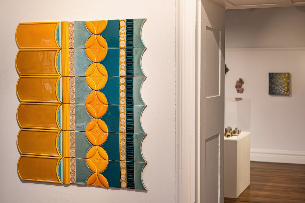
Interaction and emotional response to decoration have come to be an important part of Priest’s practice, not only in how she engages and interprets the decorative, but also how she encourages others to do so through her works. Often collaborating with other makers and organisations, Priest has often gone beyond the vessel form to achieve this in the public sphere. The award winning Tiled Corridor – a section of which is reproduced in the gallery space – that was commissioned by the Royal Edinburgh Hospital for its new centre specialising in mental health, and created in collaboration with Craven Dunhill Jackfield, one of the last manufacturers in the UK specialising in traditional hand-made decorative ceramic tiles; references the ceramic walls of the local Victorian tenements familiar to many of the residents and staff. This vibrant tactile artwork cultivates an emotional connection, creating a sense of comfort and familiarity to an otherwise austere environment in its unveiling in 2018. Another example showcased in the exhibition is the digital animation Imbrication from 2022 – sat in the far gallery space in Blackwell – which was originally commissioned by New Media Scotland for the Stepping in Screen at Music Hall Aberdeen, as a collaboration between Priest and digital artist Sam Healy. This venture into the digital sees Priest’s illustrative motifs inspired by the neo-classical architecture of the venue, encoded into an algorithm by Healy creating a mesmerising sequence that shifts and dances before your eyes, never repeating the same pattern twice, in what can easily be described as a living wallpaper.
The strength and success of both Priest’s artworks and commissions is that in their historical connection to design and decorative arts, she cultivates reassuring and familiar yet stimulating emotional encounters for all. Thus, by exhibiting her work in an environment such as Blackwell Arts and Crafts House, we are encouraged to consider that the ethos of the movement in which it was designed and built is not only alive and strong, but that Priest should rightly be considered as part of a lineage of artists, makers and designers who have visually stimulated and enriched our lives.
Sarah Rothwell is the Senior Curator of Modern & Contemporary Design, in the Department of Global Arts, Cultures and Design at National Museums Scotland, Edinburgh. Here, she has collection responsibility for the British and European glass, ceramics, metalwork, jewellery and industrial design collections circa 1945-present. She supports the sector through her position on the Board of Craft Scotland and the Council of the Society of Jewellery Historians. In addition, she has written on Priest’s practice in her paper Capturing Decorative Art – The work of Frances Priest, Journal of the Decorative Arts Society No. 45.
Frances Priest: Motif | Line | Colour is on view between November 7, 2025, and April 11, 2026, at Blackwell – the Arts & Crafts house in Bowness-on-Windermere, United Kingdom. Blackwell is part of Lakeland Arts.
Subscribe to Ceramics Now to read similar articles, essays, reviews and critical reflections on contemporary ceramics. Subscriptions enable us to feature a wider range of voices, perspectives, and expertise within the ceramics community.
Captions
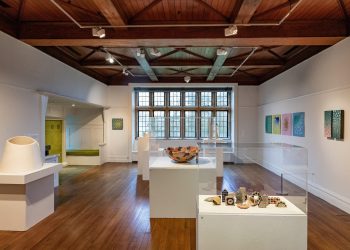
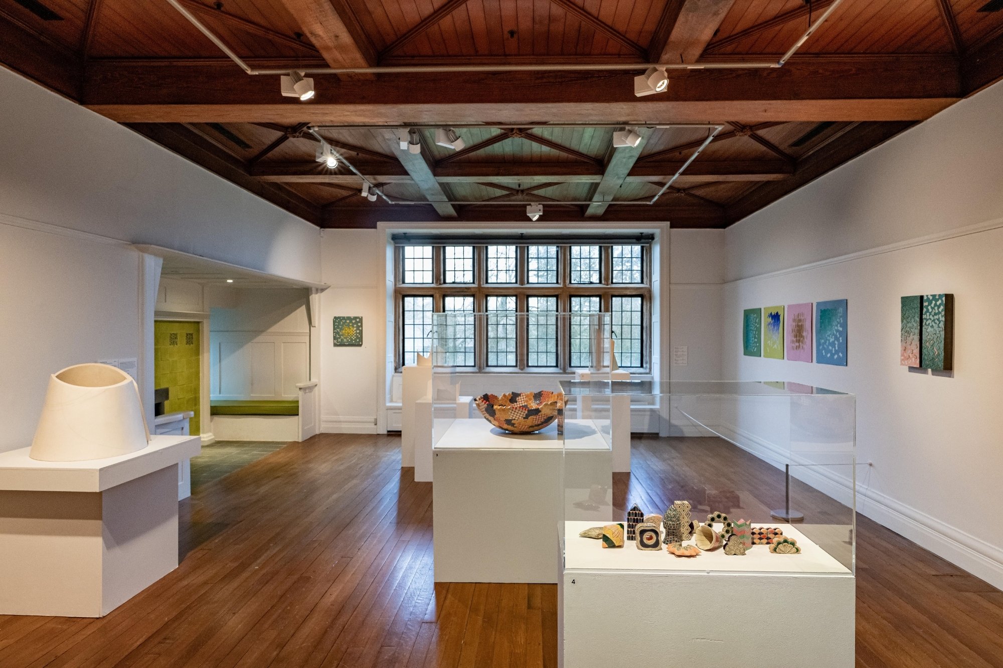
- Frances Priest: Motif | Line | Colour, Exhibition installation at Blackwell – the Arts & Crafts house. Image credit: Robin Zahler
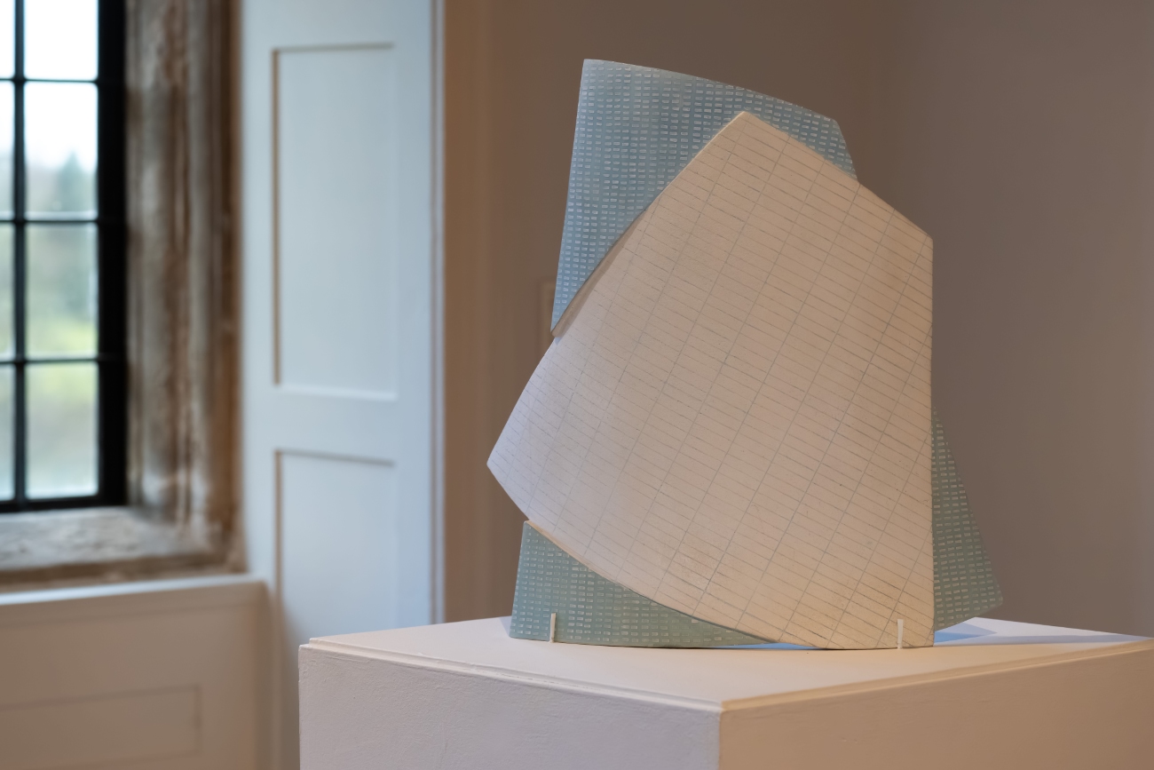
- (fig 1) White Drawing Room Collection | Chevron 1 & 4, 2025, Hand built ceramic with inscribed line and vitreous slip. Image credit: Robin Zahler
- (fig 2) Vase Form, Byzantine VIII, 2023, Ceramic form, inscribed line, earthenware glaze and vitreous slip. Courtesy of Cavaliero Finn. Image credit: Robin Zahler
- (fig 3) Drum Form | Chevron / Stripe / Asanoha, 2019, Inscribed ceramic with vitreous slip, glaze and hand-drawn enamel decals. Courtesy of the artist. Image credit: Robin Zahler
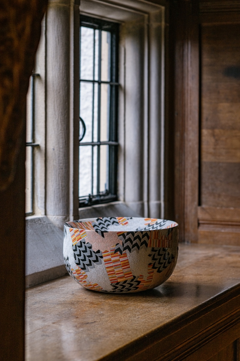
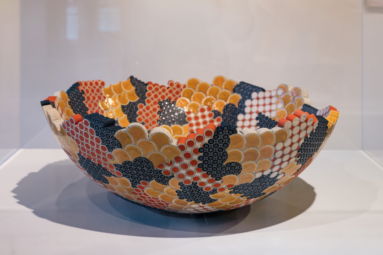
- (fig 4) Gathering Bowl: Grammar of Ornament: India I, 2017, Inscribed ceramics with vitreous slip glaze. Courtesy of the artist. Image credit: Robin Zahler
- (fig 5) Shifting Grid, 2005, Hand built ceramic with oxide inlay and vitreous slip. On loan from Susan Rice. Image credit: Robin Zahler
- (fig 6) The Grammar of Ornament India III, 2018, Press moulded and carved ceramic with incised hand drawing, blue oxide wash, vitreous slip and earthenware glaze. On loan from National Museums Scotland. Image credit: Robin Zahler
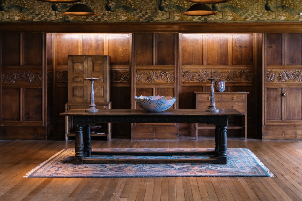
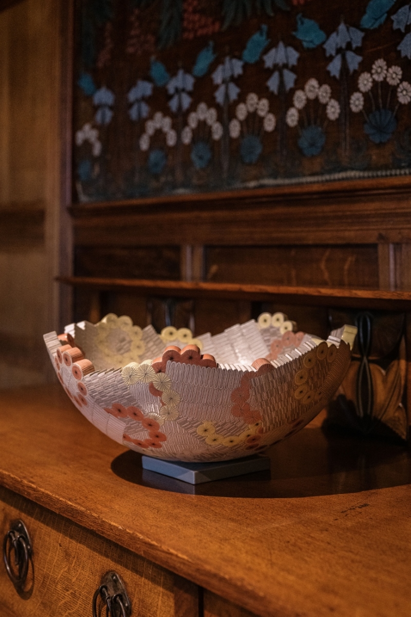
- (fig 7) Gathering Bowl – Collage medium, 2013, Press moulded and carved ceramic with incised hand drawing, hand painted glaze and enamel transfer. Courtesy of Cavaliero Finn. Image credit: Robin Zahler
- (fig 8) Vase Form, Grammar of Ornament, Byzantine No3 Colour, 2020, Hand built ceramic form, inscribed line, earthenware glaze and vitreous slip. Courtesy of Cavaliero Finn. Image credit: Robin Zahler
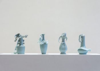
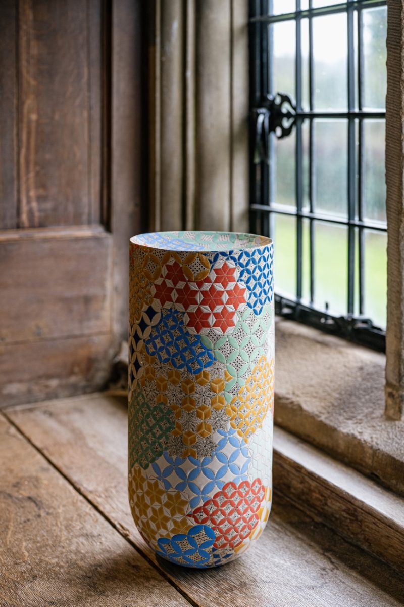
- (fig 9) Patterns of Flora – 7 parian vases, 2015, Slip case parian with enamel transfer. Courtesy of the artist. Image credit: Robin Zahler